Help Farmers Map Out Profitability With Tech
With lower commodity prices and tighter margins, it’s more important than ever for farmers to have a solid game plan for every field on their farm. The Profit Map feature within the R7® Tool is one resource that helps farmers nail down potential income based on profitability by management zones.
Deliver value
Profit Map may not be a tool you use with every farmer, but it does deliver considerable value when targeted to the right people. You’ll not only have an extra touchpoint with your customers, but helping pencil out profitability can also provide an opportunity for you to come up with creative solutions for some of those tough agronomic challenges. Being able to identify potential areas of concern and proactively manage them can greatly impact the profitability of a field, which is visualized in the Profit Map.
Plan more precisely
Profit Map is a tool that can be useful for initial production planning on the farm as well as for financial planning as market changes occur. Farmers can see very specifically how their profitability could change based on changes to their production decisions.
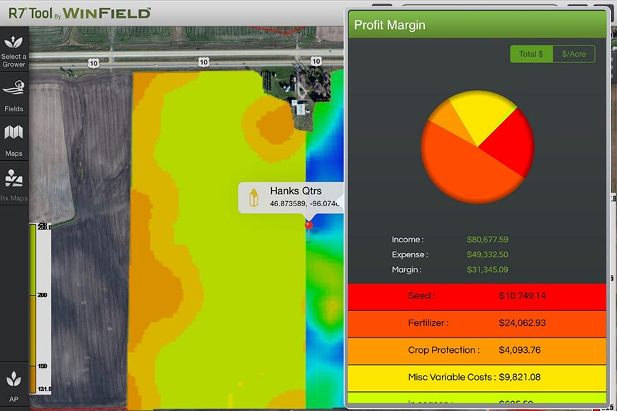
In many cases, farmers look at the profitability of the entire farm by crop. The Profit Map allows a deeper dive on a field-by-field basis and can even be looked at down to the acre level when making preseason decisions. Farmers can use the tool to analyze performance with actual inputs and harvest data at the end of the season. Inputs within the tool are customizable, as shown in the example below.

Farmers can overlay their own yield data to see profitability by management zone. In the example below, red areas of the field indicate lower productivity. Based on the input costs above, this farmer is actually losing $1.81 per acre in those areas. In contrast, the dark blue areas show the most productive ground, where the net value is $83.42 per acre.

Visualize input profitability
It’s hard for most farmers to assess productivity and manage inputs if they’re only considering a field’s average yield. For example, there might be one small, poor-yielding area pulling an entire field’s average down. The value of the Profit Map feature is that farmers can more precisely visualize problem areas in a field and can begin to analyze where to manipulate input costs to get better margins on those less productive acres while maximizing profitability on their most productive ground. For example, a farmer might decide that consistently losing money in certain parts of the field mean that it’s time to take those areas out of production or switch to another crop. Alternatively, maybe adjusting planting population on those rougher acres is a better option.
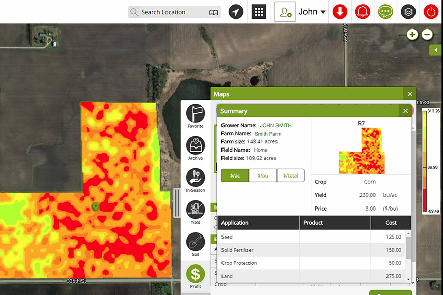
The map below shows how a farmer might use variable rate planting to maximize profitability across this field. In the lower productivity areas (red), the planting population is cut back to 28,000 seeds per acre, while in higher management zones (dark blue) populations are bumped up to 32,000 seeds per acre.

By playing around with the numbers, a farmer can see how profitability fluctuates based on input decisions. Similar results can be displayed for variable rate fertilizer applications and even crop protection products, including fungicides and herbicides.
Don’t let your farmers miss an opportunity to increase their profitability. For more information about how the Profit Map feature can help, contact your WinField United agronomist.
Deliver value
Profit Map may not be a tool you use with every farmer, but it does deliver considerable value when targeted to the right people. You’ll not only have an extra touchpoint with your customers, but helping pencil out profitability can also provide an opportunity for you to come up with creative solutions for some of those tough agronomic challenges. Being able to identify potential areas of concern and proactively manage them can greatly impact the profitability of a field, which is visualized in the Profit Map.
Plan more precisely
Profit Map is a tool that can be useful for initial production planning on the farm as well as for financial planning as market changes occur. Farmers can see very specifically how their profitability could change based on changes to their production decisions.
In many cases, farmers look at the profitability of the entire farm by crop. The Profit Map allows a deeper dive on a field-by-field basis and can even be looked at down to the acre level when making preseason decisions. Farmers can use the tool to analyze performance with actual inputs and harvest data at the end of the season. Inputs within the tool are customizable, as shown in the example below.
Farmers can overlay their own yield data to see profitability by management zone. In the example below, red areas of the field indicate lower productivity. Based on the input costs above, this farmer is actually losing $1.81 per acre in those areas. In contrast, the dark blue areas show the most productive ground, where the net value is $83.42 per acre.
Visualize input profitability
It’s hard for most farmers to assess productivity and manage inputs if they’re only considering a field’s average yield. For example, there might be one small, poor-yielding area pulling an entire field’s average down. The value of the Profit Map feature is that farmers can more precisely visualize problem areas in a field and can begin to analyze where to manipulate input costs to get better margins on those less productive acres while maximizing profitability on their most productive ground. For example, a farmer might decide that consistently losing money in certain parts of the field mean that it’s time to take those areas out of production or switch to another crop. Alternatively, maybe adjusting planting population on those rougher acres is a better option.
The map below shows how a farmer might use variable rate planting to maximize profitability across this field. In the lower productivity areas (red), the planting population is cut back to 28,000 seeds per acre, while in higher management zones (dark blue) populations are bumped up to 32,000 seeds per acre.
By playing around with the numbers, a farmer can see how profitability fluctuates based on input decisions. Similar results can be displayed for variable rate fertilizer applications and even crop protection products, including fungicides and herbicides.
Don’t let your farmers miss an opportunity to increase their profitability. For more information about how the Profit Map feature can help, contact your WinField United agronomist.
Related Articles