4 Tips to Mapping Out Yield Conversations
Are you looking for new methods to engage farmers before and while the combines are rolling? If so, here are some ways to use the R7® Tool to estimate yields. Assuming that you are already talking with the farmer and observing fields that are nearing maturity, there are only a few more ag technology steps to take to help enrich the conversation.
The process that follows can help you do three things:
1. Select a Yield Potential Map.
Available through the R7® Tool, this map lets you know which areas have optimal yield potential and greater biomass levels (the darker the blue, the higher the yield potential and biomass) and it reveals lower-producing areas (red and yellow blocks). Use these as indicators of where the farmer should focus input efforts, to help prioritize applications and harvest order, and to determine the number of zones to account for.
![]()
2. Make an Rx map.
Take this analysis one step further and make an Rx map of the field to define different zones. You may need to map out several zones to get good definition of higher-yield-potential areas and lower-yield-potential areas. When performing yield checks, use this map as a guide to gather representations from each zone. Creating an Rx map helps you get a better indication of the variances present in a particular field. To get the best estimate, make sure all zones are accounted for.
![]()
3. Enter yield checks to determine outcomes.
The R7® Tool will now take that yield for each zone and calculate an average for the field that you can use to compare to the actual yield. You can download a yield estimator app or figure an estimate in your head. This will enable you not to base your estimate on one good corn ear or one bad ear. Instead, it will help you to see the entire field and get an overall average yield and a more complete idea of what the farmer’s year may end up looking like.
With the R7® Tool’s current functionality, you will have to do a bit of a workaround to compare estimated yield with actual yield. In this example, instead of seeds per acre, I entered the estimated bushels per acre in the seeds/ac column in each zone (in this case, zones 1 to 6). So the actual yield for the field shown below was 186 bushels per acre while the average yield estimated was 181.95 bushels per acre.
![]()
4. Easily create a farmer handout.
If you’d like to have something to talk through with the farmer, you can take pictures of the ears in your samples and make a simple collage using an application such as Pic Stitch. In the example below, Zone 1 had 25,000 harvestable ears — a mid-range yield denoted in the yellow and red areas in the map. On the other hand, Zone 3, with 29,000 harvestable ears, had a few problem ears but a better overall yield (green and light blue areas). Zone 6, with 31,000 harvestable ears, had the highest-quality ears and the best overall yield, shown in the dark blue and purple areas.
![]()
You can also take the map with you when riding in the combine with the farmer. It can be a fun way to hone your estimation skills as well.
In my experience, I have used these steps to proactively identify issues. For example, I saw an area that, judging from a map, should have been high in yield, but was in fact very low in yield, which can be an indication of nitrogen loss. Having this conversation with a particular farmer led him to do a split application of nitrogen for the next corn year and to use a nitrogen stabilizer to address the problem. These actions all came from one candid conversation about an imagery map.
The process that follows can help you do three things:
- Obtain better crop samples.
- Validate the power of imagery.
- In some cases, identify issues proactively.
1. Select a Yield Potential Map.
Available through the R7® Tool, this map lets you know which areas have optimal yield potential and greater biomass levels (the darker the blue, the higher the yield potential and biomass) and it reveals lower-producing areas (red and yellow blocks). Use these as indicators of where the farmer should focus input efforts, to help prioritize applications and harvest order, and to determine the number of zones to account for.
2. Make an Rx map.
Take this analysis one step further and make an Rx map of the field to define different zones. You may need to map out several zones to get good definition of higher-yield-potential areas and lower-yield-potential areas. When performing yield checks, use this map as a guide to gather representations from each zone. Creating an Rx map helps you get a better indication of the variances present in a particular field. To get the best estimate, make sure all zones are accounted for.
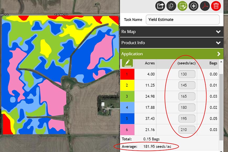
3. Enter yield checks to determine outcomes.
The R7® Tool will now take that yield for each zone and calculate an average for the field that you can use to compare to the actual yield. You can download a yield estimator app or figure an estimate in your head. This will enable you not to base your estimate on one good corn ear or one bad ear. Instead, it will help you to see the entire field and get an overall average yield and a more complete idea of what the farmer’s year may end up looking like.
With the R7® Tool’s current functionality, you will have to do a bit of a workaround to compare estimated yield with actual yield. In this example, instead of seeds per acre, I entered the estimated bushels per acre in the seeds/ac column in each zone (in this case, zones 1 to 6). So the actual yield for the field shown below was 186 bushels per acre while the average yield estimated was 181.95 bushels per acre.
4. Easily create a farmer handout.
If you’d like to have something to talk through with the farmer, you can take pictures of the ears in your samples and make a simple collage using an application such as Pic Stitch. In the example below, Zone 1 had 25,000 harvestable ears — a mid-range yield denoted in the yellow and red areas in the map. On the other hand, Zone 3, with 29,000 harvestable ears, had a few problem ears but a better overall yield (green and light blue areas). Zone 6, with 31,000 harvestable ears, had the highest-quality ears and the best overall yield, shown in the dark blue and purple areas.
You can also take the map with you when riding in the combine with the farmer. It can be a fun way to hone your estimation skills as well.
In my experience, I have used these steps to proactively identify issues. For example, I saw an area that, judging from a map, should have been high in yield, but was in fact very low in yield, which can be an indication of nitrogen loss. Having this conversation with a particular farmer led him to do a split application of nitrogen for the next corn year and to use a nitrogen stabilizer to address the problem. These actions all came from one candid conversation about an imagery map.